
There was a time when you could identify a brand from across the room.
The sharp angles of old tech logos. The ornate typography of luxury fashion houses. The weird mascots. The gradients. The chrome. The excess. Brands wanted to feel distinct, loud, even a little chaotic. Individuality was prized and every brand tried to stand out from the background.
Now? Everything looks like it was designed by the same five agencies using the same sans-serif font pack. Cars came in every color, a parking lot from a bird’s eye view might have looked like some giant had spilled a bag of skittles, then one fine day it was all black white or grey with a sprinkle of the rare occasional blue or red car. This cycle applies to architecture as well, the ornate buildings with facades that narrated a story gave way to little boxes stacked on top of each other with minimal detail, efficiency became the primary objective, cheaper, faster, one fits all.
Fashion brands that once had strong visual identities now resemble minimalist skincare startups. Tech companies look interchangeable. Corporate rebrands arrive with predictable fanfare, followed by the same reaction online:
“Why does everything look so bland now?”
It’s a fair question. But the answer is more complicated than “designers got lazy.” And btw, this is not a complaint, or a rant about the good ol days, just a visual observation of the trends we go through and an analysis of the why.
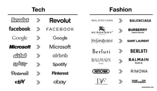
The Internet Flattened Branding
Most classic logos were designed for a physical world.
They needed to work on:
- storefronts
- packaging
- magazine ads
- television
- billboards
- embroidered uniforms
But modern logos live somewhere else entirely | Today, a brand identity has to survive in different mediums as:
- app icons
- favicons
- mobile headers
- responsive interfaces
- smartwatches
- dark mode
- video overlays
- social media avatars
- animation systems
A logo that looked incredible on a storefront in 1994 might completely fail as a 32×32 pixel icon on a phone. Size is a big reason too, while a family crest might have looked awesome on the side of a building or a knight’s shield, when you reduce that to a one by one inch space things get fuzzy.
That reality is part of what changed design itself.
Complex marks became simplified. Thin details disappeared. Typography became cleaner. Geometry became safer. Flat design replaced texture because texture often breaks across digital systems.
In many cases, these redesigns genuinely function better.
They scale better, they animate better, they reproduce better across platforms.
The problem is that functional optimization often comes at the expense of personality.
Minimalism as a Business Signal
The rise of Silicon Valley accelerated this shift.
Once companies like:
- Apple
- Airbnb
- Uber
normalized ultra-clean visual systems, minimalism stopped being just a design choice. It became a signal. And once that gains momentum everyone jumps on the bandwagon to avoid looking dated and old.
Clean branding started communicating:
- scalable
- modern
- frictionless
- trustworthy
- investor-friendly
- tech-enabled
And once investors, executives, and startup culture began associating minimalist branding with competence, everyone else followed.
This is why a luxury fashion brand and a fintech startup can suddenly feel visually adjacent. They are both optimizing for the same cultural language of “modernity.”
Corporate Design Is Risk-Averse by Nature
Another uncomfortable truth: most large companies are terrified of visual risk. The funny thing is that when you go risky and piss people off, you are getting free interaction, you know how they say there is no such thing as bad publicity?
Distinctive branding creates emotional reactions. That’s the point of memorable design. But strong reactions also make executives nervous.
A weird logo might become iconic.
It might also become a meme.
So many modern rebrands are designed not to offend anyone. To be easy to reproduce across mediums and to be accessible to all.
The result is branding by committee:
- safe typography
- safe spacing
- safe geometry
- safe palettes
Not because designers lack creativity, but because corporations often optimize for consensus instead of memorability. The irony is that the safest possible design decision can also become the least recognizable.
The Logo Matters Less Than the System
This is the part most people miss. In the 1980s or 1990s, the logo carried a massive portion of the brand identity.
Today, branding is distributed across an entire ecosystem:
- UI design
- motion graphics
- sound
- product behavior
- social voice
- packaging systems
- content style
- interaction patterns
Modern brands are experienced continuously, not just seen. A company like Netflix can get away with an extremely simple logo because the product experience itself carries most of the brand recognition.
The interface, animation, recommendation system, loading sound, thumbnails, tone, UX, etc.
The logo is now just one piece of a much larger identity machine.
Is the Pendulum Swinging Back?
Interestingly, we may already be reaching peak minimalism. As every brand converges into the same clean aesthetic, distinctiveness becomes valuable again.
You can already see the backlash emerging:
- expressive typography
- retro aesthetics
- mascots
- maximalism
- asymmetry
- handcrafted textures
- weirdness
- intentionally imperfect systems
Design history always moves in cycles.
Ornament becomes excessive > Minimalism reacts against ornament > Minimalism becomes sterile > Expression returns.
The current wave of “everything looks the same” may simply be the final stage before the next visual rebellion.
And honestly, that rebellion is overdue.